Readings
Notes on the works: UNDER THE SIGN OF WARNING
Agatha Gothe-Snape
Agatha Gothe-Snape's notes on artworks in her 2025 solo exhibition UNDER THE SIGN OF WARNING at The Commercial
Agatha Gothe-Snape, Notes on the works: UNDER THE SIGN OF WARNING, exhibition catalogue, The Commercial, Sydney, 2025
Agatha Gothe-Snape's notes on artworks in her 2025 solo exhibition UNDER THE SIGN OF WARNING at The Commercial
Agatha Gothe-Snape, Notes on the works: UNDER THE SIGN OF WARNING, exhibition catalogue, The Commercial, Sydney, 2025
1.
What
colour is really bad? What colour is catastrophic? At what point do we flee or
is it better to stay and protect property. What protection does colour offer?
Shade, like colour, is ephemeral and measly in the face of climate catastrophe.
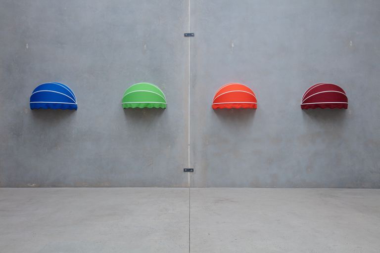
Recently a colour and symbol-coded Australian Warning System was created and
enforced throughout Australia.
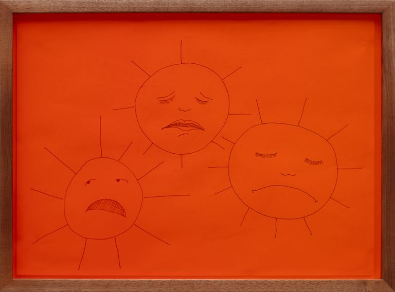
2. Suns that give and ask nothing in return but feel tired and sad. Peering through or subject to intensely-coloured French antique glass from the 1980s, mouth-blown, each produced using a different alchemical process. Bataille - 'Rotten Sun', Thacker - Sad Planets.
3. Two entities (after Calvino) orbiting each other and rotating around their own axes but never touching or approaching contact. Permanent tension and misreading signs and signals. Shouting out to each other and the room, the channel is open. Also, a communication device, sender and receiver, A and B. Also, a parlour game (planchette, talking board, turning tables).
4. A text message to myself as I change.
5. An Uber driver’s advice about how to invest in crypto currency made permanent and invaluable.
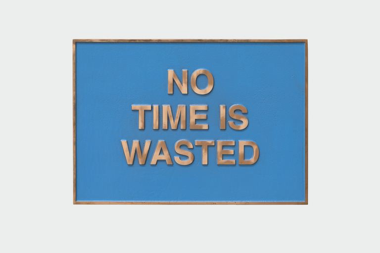
6. A printed affirmation to rally against the terror of an unrenewable resource.
7. A series of prompts in the form of stock photographs, cap references and words coagulate to make a whole collection of wrong images that emit inadvertent malevolence. Each time I make a request Dall-e produces a white bro-man in the crowd, although this is not part of the specificity of my request. I want to give the impression the cap has travelled through time, is timeless, it existed in a mall on a head, maybe at Paddy’s or Pitt Street Mall in 1998 before I had it made this year in 2025. A secret anachronistic object, I guess all objects are time travellers. I then subjected the image to the same process as Redon’s and now they sit side-by-side; one synthetic, the others origin ‘true’ although I'm now not sure who I believe or why.
8. Using Odilon Redon’s image from 1901 as starting point, an image of both interiority and connection with the divine through the natural world (the tree and the woman form a crucifix). Redon himself, and the viewer are excluded from the black interior of the woman’s inward gaze. I have applied a gaussian blur (my favourite effect) to give the image a sense of being dragged through time or memory or sleep or derangement. Then divided its specific and masterful tempera colours into the modern printer’s eye (CMYK). What holds?
9. A visual reference to accompany my order to Magnets Australia for pieces of magnetic sheet for the Floor Mobile. Printed in 3 layers. A template for production? Signs under signs, a hidden/covert system known only by those who make the sign.
10. A personal screen-printing challenge – Theosophy leader Annie Besant made it her life's work to find a way to represent the invisible forces (thought forms and the colours emitted by living things) in tangible legible ways. Already a representation and removed from its energetic truth, this key to the colour of thoughts was printed as the opening plate in Besant and Leadbeater’s widely distributed Thoughtforms book. I came to it via Joanna Drucker’s Substack. Like with Woman Sleeping Under a Tree the process of disassembling and assembling this impossible code helped me see it for the first time.
11. The hats needed a rack. As they sell, the verticality of the rack is exposed but we can always have more made. The rack is like a thermometer or water level measure. Its purpose is to track an inevitable but slow-moving catastrophe or fever.
12. The Coloursigns Deck is a set of digitally-printed colour cards designed by Ella Sutherland with short meditations on colour by Jaimee Edwards printed on the inverse. Jaimee and I have been working together in the studio developing a variety of writing practices where we write together using prompts and durational periods of time. These short meditations took as their starting point Jung’s ‘digging exercise’, which we often did before writing sessions. The cards hark back to my childhood fascination with the Luscher Colour Test and Jaimee’s interest in tarot. To make a reading the reader might arrange the colours on the table according to their mood, feeling or aesthetic preferences. The cards can then be turned over the create a kind of textual exquisite corpse that invites chance, synchronicity, and the unconscious to the table, continually reconfiguring the essay in new arrangements. The cards could be used in the exhibition or in daily life as a code, key or colour chart.
2. Suns that give and ask nothing in return but feel tired and sad. Peering through or subject to intensely-coloured French antique glass from the 1980s, mouth-blown, each produced using a different alchemical process. Bataille - 'Rotten Sun', Thacker - Sad Planets.
3. Two entities (after Calvino) orbiting each other and rotating around their own axes but never touching or approaching contact. Permanent tension and misreading signs and signals. Shouting out to each other and the room, the channel is open. Also, a communication device, sender and receiver, A and B. Also, a parlour game (planchette, talking board, turning tables).
4. A text message to myself as I change.
5. An Uber driver’s advice about how to invest in crypto currency made permanent and invaluable.
6. A printed affirmation to rally against the terror of an unrenewable resource.
7. A series of prompts in the form of stock photographs, cap references and words coagulate to make a whole collection of wrong images that emit inadvertent malevolence. Each time I make a request Dall-e produces a white bro-man in the crowd, although this is not part of the specificity of my request. I want to give the impression the cap has travelled through time, is timeless, it existed in a mall on a head, maybe at Paddy’s or Pitt Street Mall in 1998 before I had it made this year in 2025. A secret anachronistic object, I guess all objects are time travellers. I then subjected the image to the same process as Redon’s and now they sit side-by-side; one synthetic, the others origin ‘true’ although I'm now not sure who I believe or why.
8. Using Odilon Redon’s image from 1901 as starting point, an image of both interiority and connection with the divine through the natural world (the tree and the woman form a crucifix). Redon himself, and the viewer are excluded from the black interior of the woman’s inward gaze. I have applied a gaussian blur (my favourite effect) to give the image a sense of being dragged through time or memory or sleep or derangement. Then divided its specific and masterful tempera colours into the modern printer’s eye (CMYK). What holds?
9. A visual reference to accompany my order to Magnets Australia for pieces of magnetic sheet for the Floor Mobile. Printed in 3 layers. A template for production? Signs under signs, a hidden/covert system known only by those who make the sign.
10. A personal screen-printing challenge – Theosophy leader Annie Besant made it her life's work to find a way to represent the invisible forces (thought forms and the colours emitted by living things) in tangible legible ways. Already a representation and removed from its energetic truth, this key to the colour of thoughts was printed as the opening plate in Besant and Leadbeater’s widely distributed Thoughtforms book. I came to it via Joanna Drucker’s Substack. Like with Woman Sleeping Under a Tree the process of disassembling and assembling this impossible code helped me see it for the first time.
11. The hats needed a rack. As they sell, the verticality of the rack is exposed but we can always have more made. The rack is like a thermometer or water level measure. Its purpose is to track an inevitable but slow-moving catastrophe or fever.
12. The Coloursigns Deck is a set of digitally-printed colour cards designed by Ella Sutherland with short meditations on colour by Jaimee Edwards printed on the inverse. Jaimee and I have been working together in the studio developing a variety of writing practices where we write together using prompts and durational periods of time. These short meditations took as their starting point Jung’s ‘digging exercise’, which we often did before writing sessions. The cards hark back to my childhood fascination with the Luscher Colour Test and Jaimee’s interest in tarot. To make a reading the reader might arrange the colours on the table according to their mood, feeling or aesthetic preferences. The cards can then be turned over the create a kind of textual exquisite corpse that invites chance, synchronicity, and the unconscious to the table, continually reconfiguring the essay in new arrangements. The cards could be used in the exhibition or in daily life as a code, key or colour chart.